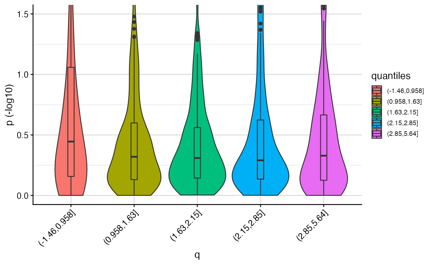
Violin plot of p-values for quantiles of q
corr_plot.RdViolin plot of p-values for quantiles of q
corr_plot(p, q, ylim = c(0, 1.5))
Arguments
| p | p values for principal trait (vector of length n) |
|---|---|
| q | auxiliary data values (vector of length n) |
| ylim | y-axis limits (-log10) |
Value
ggplot object
Details
Can be used to investigate the relationship between p and q
If this shows a non-monotonic relationship then the cFDR framework should not be used
(because e.g. cFDR cannot simultaneously shrink v-values for high p and low p)
Examples
# In this example, we generate some p-values (representing GWAS p-values)
# and some arbitrary auxiliary data values (e.g. representing functional genomic data).
# We use the corr_plot() function to visualise the relationship between p and q.

# generate p
set.seed(1)
n <- 1000
n1p <- 50
zp <- c(rnorm(n1p, sd=5), rnorm(n-n1p, sd=1))
p <- 2*pnorm(-abs(zp))

# generate q
mixture_comp1 <- function(x) rnorm(x, mean = -0.5, sd = 0.5)
mixture_comp2 <- function(x) rnorm(x, mean = 2, sd = 1)
q <- c(mixture_comp1(n1p), mixture_comp2(n-n1p))

corr_plot(p, q)